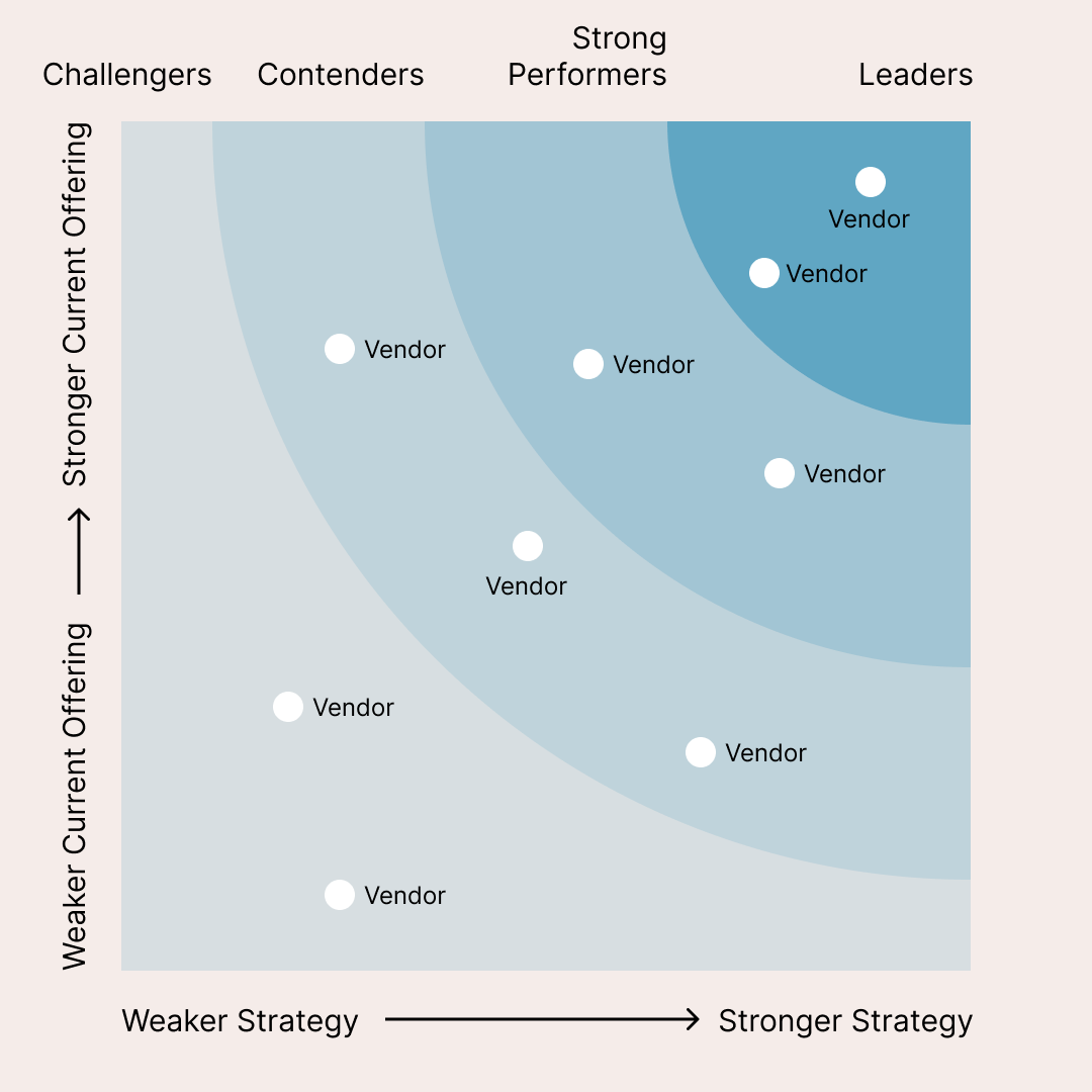
The Forrester Wave diagram is a leading vendor comparison chart that evaluates solutions on axes like Current Offering and Strategy, spotlighting market Leaders, Strong Performers, Contenders, and Challengers. This fully editable Forrester Wave template empowers business analysts, marketers, and strategists to customize vendor positions, labels, colors, and criteria for professional presentations, reports, or pitch decks.
Key Customization Features
Adapt the quadrant chart effortlessly by renaming vendors, adjusting plot points, and redefining axes to match your evaluation metrics. Incorporate branding, add data labels, or integrate legends for polished visuals, then export in high-resolution formats ideal for PowerPoint, Google Slides, or PDF reports.
Expanded Use Cases
Go beyond traditional vendor assessments by applying the diagram to talent reviews, where you map team members by performance and growth potential. Use it for product roadmaps to compare features on execution versus innovation, for investment rankings to evaluate opportunities by risk and return, or for customer segmentation to plot segments by value and engagement for targeted marketing strategies.