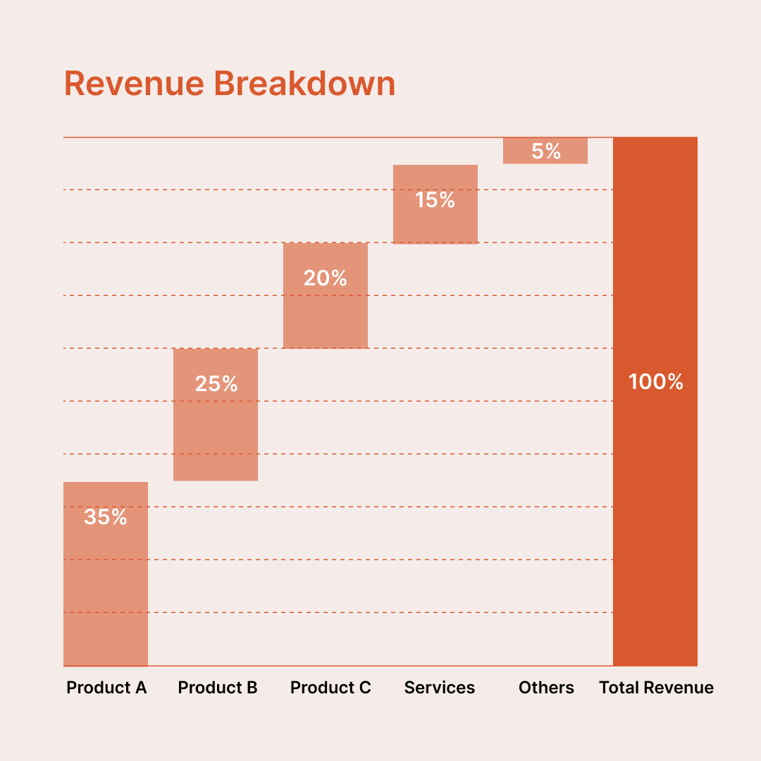
Visualise how individual components contribute to a total with this waterfall chart diagram. Ideal for showing revenue breakdowns, cost composition, or percentage contributions, this diagram helps audiences quickly understand how parts add up to 100%.
Unlike spreadsheet-generated charts, this waterfall diagram is completely editable and built specifically for presentations. Every bar, label, and colour can be adjusted to match your existing slide theme, brand colors, and typography, ensuring it blends seamlessly into your deck.
This template uses a manual, shape-based structure, giving you full visual control without being constrained by chart engines or default styling. While values are adjusted manually, this approach is often preferred by designers, consultants, and presenters who want pixel-perfect layouts, consistent spacing, and presentation-ready aesthetics.
Why use a manual waterfall diagram?
Common use cases
If you care more about clarity, flexibility, and visual polish than spreadsheet automation, this waterfall chart diagram is a reliable, presentation-ready solution.